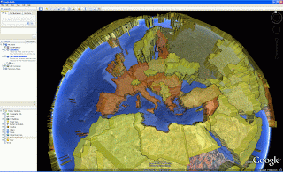
Click here for the KML file.
I'll be switching to a 30 day view rather than a 48 hour period once enough data has been sufficiently captured. I'm accepting requests for private services if anyone would like access to the data in a different format than provided.
The data comes from some of the regualr exchange rate sites and it was a case of a using a mixture to identify all the currencies used in the world. Before now i had no idea you could use the Euro in South America and off the coast of Canada. It's been bit of a lesson in geography 101 tbh.
Anyway hope you enjoy.

3 comments:
Ah. There's a current bug with weekend generation of the data. I didn't realise but of course the exchange markets close for the weekend like everyone else i guess. There's no changes in the data from Saturday to Sunday so no thematics are generated. I'll put in the fix tomorrow.
Would be cool to see the numbers. Thanks for sharing!
Numbers are in there. Have you tried clicking on a country?
Post a Comment